There are a lot of opinions about what a marketing email should look like.
Don't use images. Keep it plain text. Put your button at the bottom. Put your button at the top. Make it beautifully branded. Make it look like you've just typed it in Gmail. Don't use too many colours. Don't use too much text.
Helpful, isn't it?
Email design is one of those subjects where a perfectly sensible piece of advice gets repeated so many times that eventually it becomes a RULE. Then we end up worrying that one photo is going to send our lovingly written newsletter directly to the spam folder.
So, what actually matters when you're designing an email? Because good email design isn't really about making your emails look fancy, it's about making them easy to read, understand and act on, wherever and however somebody happens to be reading them.
Your email doesn't need to win a design award
I work in a lot of email marketing accounts, and I can promise you that adding another beautifully designed banner isn't usually the thing that's going to transform someone's email marketing campaign.
Your email has a job to do.
Maybe you're sharing something useful. Maybe you're telling people about a new service. Maybe you want someone to book a call, read your latest blog or buy something.
The design should help them do that.
This is where I think we sometimes get a bit carried away. We see the gorgeous newsletters sent by big brands with graphic designers, photographers and entire marketing teams behind them, then assume ours needs to look the same. It doesn't.
For most small businesses, a clear email that's easy to read, feels recognisably like you and makes the next step obvious is doing its job perfectly well.
If you've read my blog What a “good enough” email setup actually looks like, you'll know I'm a big fan of getting the useful stuff working before worrying about making everything perfect and the same applies here.
Myth: images are bad for email
This comes up often. Should we use images in marketing emails? Will they affect deliverability? Should every email just be text?
Images themselves aren't the enemy, they can add personality, demonstrate something you're talking about, break up a longer email or simply make the whole thing feel more like your brand. The problem comes when your email relies on the image to communicate the message.
Some people have images turned off in their email client, others use screen readers. If your big beautiful graphic contains the words “Workshop, Tuesday 7pm, click here to book” and none of that information appears anywhere else, some subscribers could completely miss it. Which is why alt text matters too.
Alt text is the description attached to an image so someone can understand what it contains if they can't see it. It's particularly important for people using screen readers, and it's one of those tiny bits of email housekeeping that's very easy to forget.
So absolutely do use the photo. Use your graphics. Use the snap from the latest event you went to. You can even use the dodgy picture of you holding a cup of tea, if it makes sense. Just don't make your entire email one enormous image and call it done.
Mobile first.
Because that's probably where your email is going to be read. I create emails on a computer, you probably do too. Which makes it very easy to forget that your lovely spacious email is going to be squished onto a much smaller screen for many of the people reading it.
This is why I always want to know what an email looks like on mobile before it goes anywhere.
Is the text comfortably readable without zooming in? Does that beautiful two-column section turn into something peculiar? Are the buttons big enough to tap with a thumb? Has your giant header image taken over the entire first screen?
That last one brings us neatly to something I think gets overlooked far too often.
The fold
“The fold” is an old newspaper term. The most important stories went above the physical fold because that was the bit people could see when the newspaper was stacked up.
We use the same idea online.
In email, above the fold is essentially what someone can see before they start scrolling → → →
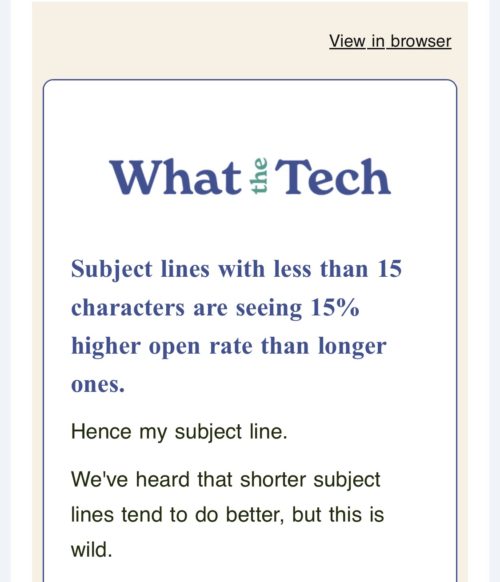
There isn't one universal fold because we're all using different phones, screens, email apps and settings. I'm not going to tell you that your CTA needs to sit precisely 427 pixels from the top of your email because that would be ridiculous. The principle, though, is useful.
Open one of your own emails on your phone and look at what you see before you scroll.
Is it your logo? A massive image? “View this email in your browser”?
Three lines of waffle before you get anywhere near the reason you emailed them?
We're working with a fairly small bit of space, so we need to ensure that first screen gives the reader a reason to carry on. That doesn't mean cramming everything into the top of the email. It means being deliberate about what gets that prime bit of space.
Your button is allowed near the top
Another rule we can chuck in the “it depends” drawer is that your call-to-action (CTA) button should always go at the bottom.
Sometimes it should. If I need to explain something to you before asking you to make a decision, a button after that explanation makes complete sense.
Other times, your already knows what’s going on. Perhaps you've opened an email because the subject line says bookings are now open. You don't necessarily want to read seven paragraphs before you can find the booking button.
Put one near the top. You can always put it in again later.
Good CTA placement is less about following a formula and more about asking when would my reader reasonably be ready to take this action? Buttons are also generally easier to tap on mobile than a tiny bit of hyperlinked text, so make the action easy to spot and easy to use.
Dark mode can make your beautiful email look... interesting
Here's a fun one.
You spend ages getting your email looking lovely. Your colours work, your logo looks great, you send yourself a test.
Perfect.
Then someone opens it in dark mode.
Different email clients handle dark mode differently. Some leave your colours alone, some change parts of them and others can invert much more of the design. That means you can't completely control what every subscriber sees.
Logos are a classic example. A dark logo with a transparent background might look lovely on white and then virtually disappear when the background becomes dark.
This isn't a reason to panic and create seventeen versions of every newsletter. It's a reason to test. Send the email to yourself. Look at it on your phone. Try light mode and dark mode. Check that your text is readable, your buttons are obvious and your logo hasn't vanished into the abyss.
You don't need pixel-perfect consistency everywhere, but you do need the email to work.
AI is changing what people see before they even open your email
This is the newer bit of email design that I think we're going to have to pay more attention to. For years we've talked about the subject line and preheader — the little preview of text you see alongside or underneath the subject line in your inbox.
Now AI is getting involved.
Some email apps generate their own summaries of messages. Apple Mail, for example, can show an automatically generated short summary in the inbox for people using supported Apple Intelligence features. Gmail is also introducing more AI-generated summaries and overviews. Which means we have even less control over exactly what somebody sees before they open our email.
You don’t need to start writing emails for a robot, but the opening of your email now matters more than ever.
If your first few paragraphs take forever to get to the point, or the important information is buried halfway down beneath a giant graphic, we're making it harder for both humans and technology to understand what the email is actually about.
Tell people why you're emailing them and make the important information easy to find. If you’re sharing a long and winding story that’s fine, just remember the overall purpose of that email and make sure you’re giving enough information to tease them to open.
Accessibility isn't an optional extra
A lot of the things we've already talked about also accessibility considerations.
- Readable font sizes
- Good contrast between text and backgrounds
- Buttons that are easy to see and press
- Alt text on useful images
- Not putting essential information solely inside a graphic
- Link wording that actually tells someone where the link goes rather than seventeen different versions of “click here”.
None of those things make your email less attractive, they make it easier for your reader to use. Yes use. Use as the marketing and communication tool it is intended to be. Which is really what we're trying to achieve with email design in the first place.
So what does a well-designed email actually look like?
Potentially it’s quite simple.
It looks like your business, without your branding taking over the whole email. It works on a phone. The text is comfortable to read. Images add something rather than carrying all the important information. The main action is easy to find. It still makes sense if somebody is using dark mode, has images switched off or is using assistive technology.
Most importantly, the design helps the reader understand why you've emailed and what they can do next.
So before your next email goes out, don't ask yourself whether it's pretty enough. Send yourself a test, open it on your phone and look at the first screen before you scroll. Try it in dark mode, click the buttons and if you can, see what ot looks like with the images switched off if you can.
Then ask yourself:
Can I read it? Do I understand it? Can I easily do the thing this email is asking me to do?
If the answer is yes, you're doing a pretty good job.
Read next...
If you're getting your email marketing set up and want to keep things simple, you might also like:
→ What a “good enough” email setup actually looks like
→ What is an email automation?